Dec 10, 2025
UX, Web Design
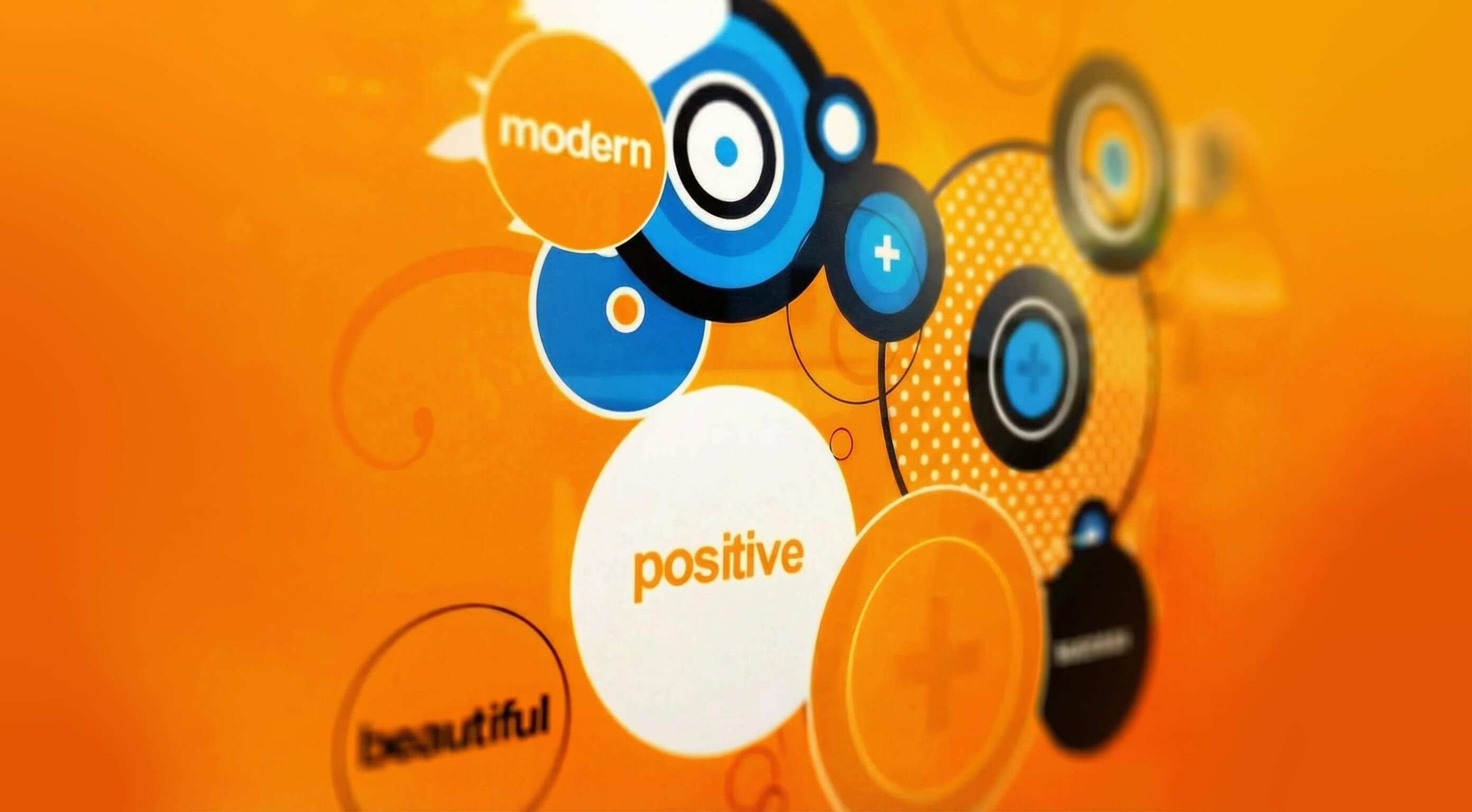
A user focused approach to web design
Website design is not decoration. It is a solution-led discipline built on logic, structure, and intent. At its best, it solves real problems and meets real needs.

The key to meaningful online engagement is simple. Put the focus on the user. The human. The decision-maker.
User-centred design responds to how people actually think, feel, and behave. When a site is designed around their needs, motivations, and limitations, it becomes easier to use, easier to trust, and far more likely to invite deeper exploration.
The first step toward better engagement is understanding your audience on both a rational and emotional level. That insight allows you to step back and review your website through their eyes, not your own, and clearly see what is working, what is not, and where friction lives.
As a starting point, here are some of the most common barriers to engagement we see from a design and layout perspective.
No clear calls to action
Many sites fail to answer a basic question. What do you want me to do next? Visitors are short on time and patience. Make it obvious. Make it valuable. Do not make them work for it.
Confusing customer journeys
When someone lands on your site, is it clear where they should go? Visitors arrive with a purpose. Your design should guide them effortlessly toward the content or solution that meets that need.
Weak positioning and unclear branding
People form an impression in seconds. If they cannot quickly understand who you are, what you do, and why you are different, confidence drops and they leave. Clarity builds trust. Say it early. Say it well.
Lack of interaction and movement
Does your site invite participation or just sit there? Thoughtful animation and interaction encourage exploration, increase dwell time, and strengthen emotional connection with your brand. Engagement breeds engagement.
Typography that underperforms
Typography is not just about aesthetics. It guides attention, creates hierarchy, and helps users navigate. Clear, confident type pulls people forward. Poor typography stops journeys dead.
Inconsistent or confusing use of colour
Colour carries meaning and emotion. It helps users scan, understand structure, and make decisions. Inconsistent or careless colour use creates confusion and weakens the experience.
Poor use of space
More content is not the problem. Too much content in one place is. Space creates focus. Structure creates flow. A clear information hierarchy makes content feel lighter, faster, and easier to absorb.
These issues may sound obvious, yet they are everywhere. Getting the fundamentals right is often the difference between a site that performs and one that quietly fails.
As ever, simplification and honesty are the real superpowers.
“Any idiot can make things complicated. It takes a genius to make things simple.”
Albert Einstein